Tuesday, 14 April 2015

April Week Three

Hello Beautiful Artists!
I have loved seeing everyone embracing this month's challenge in the Driver Reviver Facebook Group. Many people are stepping out of their comfort zones and experimenting with new techniques. 

This week I have a really easy technique for getting an artsy-looking pencil portrait onto a page without having to draw anything.

You will need:
  • A photo with good definition and contrast: it can be a photo of yourself, or from a magazine. It can be any size, but bigger is easier. It is also easier if it is printed onto normal copier paper.
  • A piece of tracing paper
  • A soft or heavy gel medium (eg, Liquitex or Golden Matte Medium, Reeves Gloss Gel Medium).
  • A plastic card to scrape with (eg., an old loyalty or credit card)
  • Pencils: 2B graphite or soft coloured pencils + eraser
  • Masking tape, washi tape or painter's low tack tape
  • A prepared background in your journal.
  • Optional: a light box or a window
Create a background however you would like. Here is what I did:
I cut scraps of patterned paper into rectangles of various sizes and glued down with gel medium:
Then I used Inktense pencils to define the edges and activated the ink with water:
I used Inktense because once they have been activated with water, then dried, the colour is permanent. The surface of my page was also glossy because of the gel medium I used and normal watercolour wouldn't adhere to the surface. Oil pastels would also have worked.
I was aiming for a background that was interesting without being dark or bold. I also wanted to see if the layered paper would give an interesting texture to the page.

Once my background was ready I prepared the portrait then adhered it the background. Here is the video:

Notes:
  • The tracing paper will wrinkle when it goes onto the glue. 
  • I have found that using gel medium results in less wrinkles than wetter glues like Mod Podge or PVA.
  • I recommend putting the glue onto the background, not onto the tracing paper. 
  • Tearing the image out of the tracing paper will feather the edges and once glued down, it will look like the image was drawn onto the background, rather than glued on.
  • Be generous with the glue.
  • Tracing paper is surprisingly tough even when it is wet from the glue. Don't be scared to scrape it firmly to get the image as flat as possible.
Here is another example, this time traced in graphite and stuck onto a painted background:
You can see in this close up that there are some small wrinkles in the tracing paper. I don't think you can get it completely smooth.
 The finished journal page:


Another example of a graphite tracing of a magazine photo. It was then coloured with paint and pencils after being stuck down. You can see that the wrinkles are larger in this transfer; I used Mod Podge Matte to adhere it. Can you also see how the edges of the tracing paper are very obvious? I cut the image out with scissors instead of tearing the edges.

I hope you will give this technique a try. If you don't have gel medium, and are wondering if it can be used for anything else, the answer is : Yes! Lots of things.
I will be sharing other techniques in the coming months that use this specific product. Good news is that unlike paints and paper, I have found that low cost does not equal low quality when it comes to this product, so if you can find a cheaper brand to experiment with, go for it!

Have fun with your art everyone, and I will leave you with this that I shared in the Driver Reviver Group a few days ago. I think we can all benefit from reading it again. Print it out and stick it in front of your art desk: 

Wednesday, 8 April 2015

April Week Two: Faces

Hello Beautiful Artists! Welcome to week Two of Self Portraits. This week I have collected several ideas on how to represent a self-portrait in different styles. Let's Go!
 
She-Art 
There are no rules that say your self-portrait has to have a face. I feel that this art is an act of rebellion. As women, our society and culture tell us that our faces are more valuable than our brains, our feelings, our talents and desires. I want a world were Marie Curie is an aspirational role model, not the Kardashian Klones.


This is the signature style of American Mixed Media artist Christy Tomlinson. Her girls are often completely faceless, with simple bodies, a bright layered background and lots of scribbley doodling detail. This video shows how she sketches the basic girl:


What I really love about this style of art is the how the words are added. The phrase is always positive and affirming and always begins with the word 'She'. I have saved a few pages of these quotes I have collected to the Driver Reviver Facebook Group for you to use in any She Art you create. The quotes are in a Word document so you can change the font and size to whatever suits you. If you are not a member of the Facebook Group, you can get a copy of it here.

If you want a really in-depth look at how Christy creates such a layered effect on a canvas, this video is worth the 25 minutes. It is essentially a promotional video for some Pink Paislee products that are no longer available, but take notice of the techniques that are used, not the products. The video doesn't show how to create the girl, Christy uses a printed die-cut girl. But the entire point of this is to use these ideas as jumping off points for your own creations. Christy also offers her own online courses in She Art girls if this style is something that sparks your imagination!


Poppets ®
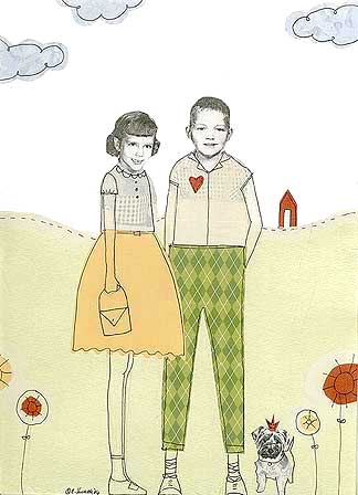
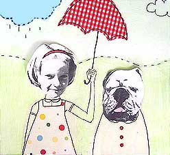
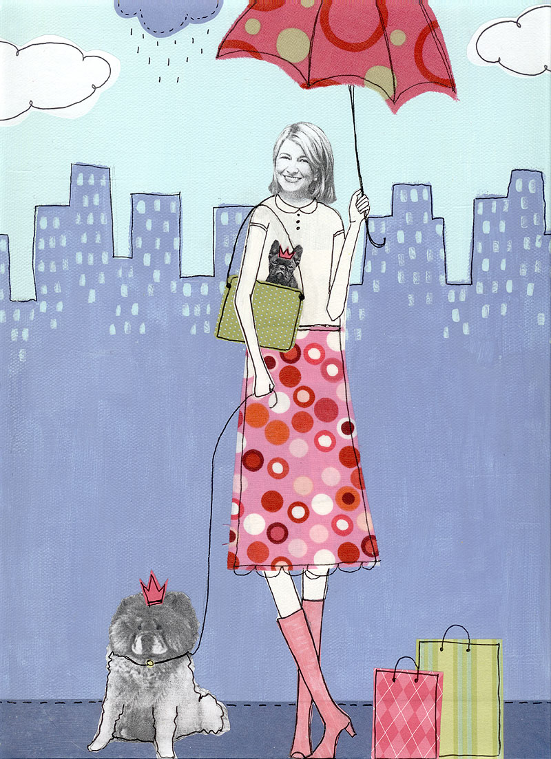
The ultimate no-draw self-portrait! Collage Artist and Illustrator Claudine Hellmuth uses black and white photographs of people then uses collage to make clothes and scenes for her Poppets. If you are an accountant who dreams of being an astronaut, be inspired!


Go to this month's Pinterest Page for more examples of this style of portrait creation.

Paint Over a Photo
If you want to do a realistic self portrait, but don't have the drawing skills necessary to execute it, this is something to try:
  1. Print out a photo of yourself on a piece of plain printer paper. 
  2. Glue the paper to your substrate using mod podge, matte medium or a soft gel medium. Use a scraper (eg. old credit card) to get all the air bubbles out.
  3. Cover the photo with an even coat of clear gesso or matte medium.
  4. Paint over the photo, use thin translucent layers of colour to build up the picture.
  5. It's a good idea to have another copy of the photo to refer to as you paint, so you know where to put shading and highlights.
Here is an example I did on a photo from a magazine:

Drawing Faces
Don't be scared of drawing faces, I promise that it is something that you can learn to do. I used to be able to draw bad stick figures with smiley-face, and now I can draw this:

The first videos are from Dina Wakley, showing how to sketch and colour a simple front-facing portrait.

How to Sketch a Face :
 How to Paint the Face:
Dina has authored two Art Journal idea books.


If drawing faces is something that you want to learn how to do, and you like a whimsical face style, I suggest you look at Tamara Laporte's free class Art, Heart and Healing delivered through her Ning site. The class is 100% free and gives very in-depth instruction on how to draw and shade a front facing portrait. Watch this video for more information on what is covered. This is the first online class I took when I started art journalling and helped me get over my mental block of "I can't draw".

Can't wait to see what you create this week. Remember to leave me a link in the comments section if you blog. I love visiting :)

See you in Driver Reviver!

Wednesday, 1 April 2015

April Week One: Collage People


I know that some of you are going to have a really strong reaction to this month's Roadtrip (maybe thinking: No Way!). The idea of creating a self portrait is confronting to many people (I know this because I am one of those people). But before you abandon the journey altogether let me point out two things:
  • A self portrait is meant to REPRESENT you, or a part of your self. It does not have to look anything like you.
  • You do not have to show ANY of your artwork to anyone if you don't want to. The reason that we looked at pocket pages and inclusions before the self portraits is so you can hide your art in your journal if you choose to. You can also cut up any drawings or painting you don't like and use it as collage.
The exquisite Frida Kahlo is my heroine when it comes to self portraits. Frida had polio as a child, and was in a near-fatal bus accident as a teenager. She suffered fractures to her spine, collarbone, ribs, pelvis, and foot and dislocated a shoulder; she was often unable to get out of bed due to the pain. She started painting when she was in a full body cast and she said "my painting carries with it the message of pain". But even though her paintings are filled with examples of the physical pain she was in, she always painted herself looking forward, meeting the viewer's eyes. To me, this is Frida's way of communicating that her spirit remained strong, even if her body was broken.

The Two Fridas by Frida Kahlo, 1939

The Broken Column by Frida Kahlo, 1944
While Frida always represented herself in the same way, other artists don't. As an example, these are all self-portraits by the same artist, Bryan Lewis Saunders:


Bryan created each portrait while under the influence of a different mind-altering substances (some legal, some not). I am definitely NOT recommending this approach to self portraits! But I find the different views of the self represented in this series very interesting.

In Art Therapy, self portraits are often used to treat self esteem and trauma issues, so what comes out can be very personal, complex and confronting. If you are interested in this topic, I recommend this article: http://www.arttherapyblog.com/art-therapy-activities/transformational-self-portrait/#.VQT-vuGQogY.


Now, before you all freak out completely, you don't have to draw anything! What we are going to look at this week is a collage technique using magazine pictures. The artist that I most associate with this style is Teesha Moore:


This Playlist show's Teesha's process from the beginning where she paints the background to the end, where she adds pen and journalling:
https://youtu.be/VqrcB49uS9M?list=PL9ceLEAK3ox2e7fPFytFYJ5_nbfGL6n9-

The playlist contains 11 videos in total, most between 5 and 8 minutes long.
If you don't have time to watch all 11 videos, just watch these four:


  • If you are not a magazine reader, or like me have gone to digital publications, ask your family and friends for any old magazines they don't need anymore or look to thrift stores and recycling centres.
  • I was able to pick up a big pile of high-end fashion magazines from my local Salvation Army Op-Shop for 20c each; which will keep me in collage heaven for a long long time.
  • I like a glue stick for the adhesive (Bostik is my preferred brand). I wouldn't recommend using a wet glue as magazine pages are thin and do not respond well (they wrinkle easily).
  • Teesha uses Pan Pastels to shade around her collage, which are beautiful, but ridiculously expensive. Use any pastel that you have. You can try applying it with a sponge or draw it on then smudge it in with your finger.Oil pastel will work just as well as chalk. Try charcoal or graphite pencil as well. Use what you have!

I hope you have fun creating your collage self-portraits. If you are blogging your Journal Journey, leave me a link in the comments section so I can check it out!
You can also share on the Facebook Driver Reviver Group.

For more inspiration, check out this month's Pinterest board, and YouTube Playlist.

Saturday, 14 March 2015

March Week Three: Driver's Ed

Here is how my page this month turned out:

The outside was created entirely with sprays. Home-made yellow, Dylusions in teal and jade and an orange Glimmermist:

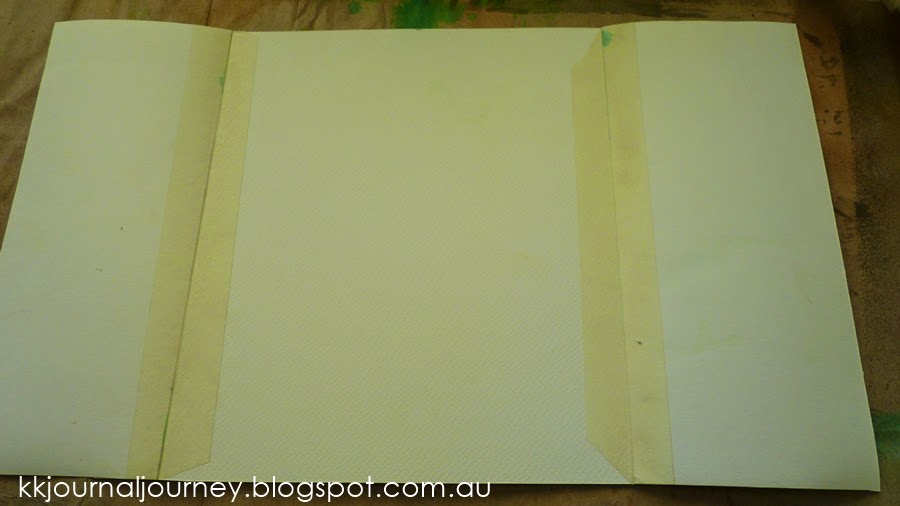
After I sprayed the A4 piece of water colour paper, I trimmed it down and cut it in half and used masking tape to turn it into doors on a 10" square piece of watercolour paper:

I then sketched out my idea on the inside page and covered the entire inside with two thin coats of white gesso. I could still see my sketch, and the gesso really helped to seal the masking tape and keep the mediums I used on the inside from leaking through to the front:

After sketching the face in, I let the page form on its own. I knew that I was creating a nature-inspired piece, and the lady I drew represents Mother Nature, or an earth goddess. The outside is bright and summery, and the inside ended up being quite dark and moody (supposed to represent that Mother Nature isn't all sunshine and rainbows, just like life). I used acrylic paints for the inside art, then added texture paste over the top through two different nature-themed stencils:

Some pink and gold sprays over the butterflies completed the inside art, then I used spray inks to blend the white paper on the sides of the page in with the doors and added the wording.
The words are printed on plain white cardstock. This is how I usually add words to my journal pages; I have a drawer dedicated to pages of words and quotes that I have printed and word stickers. I almost always use the same font (it is called My Underwood). I used sprays to colour the word strips.

Remember that there are heaps of pictures on the Pinterest page to inspire ideas, and I love to see what you have created based on the JJ prompts and lessons.

If you have been blogging about your 2015 Journal Journey, please leave me a link in the comments section so I can check it out. You can also share in the Facebook Driver Reviver Group.

Saturday, 7 March 2015

March Week Two: Spray Inks

So many questions about Spray Inks! This is a huge tutorial, so I hope you have a cup of your favourite. Let's go!

I asked the question in the Driver Reviver Facebook Group and I have addressed each question separately. The links will take you to a relevant video, if you are interested in learning more about a particular topic. The first video below is a the tutorial from me covering the basics of using sprays and how to Not Get Mud:


  Q. How do I not get mud when I use more than one colour? 
See video above.

Q. What is the difference between spray inks, spray paints and stains?
Really, I don't think there is a difference, at least not for our purposes. They are all colourants with different properties, some shimmer, some are more opaque than others, some are permanent, some are water reactive. It really is about the delivery method here. If you want to know more about the science of what makes a paint a paint as opposed to an ink, I suggest reading this.

Q.What can I use to make my own Sprays ?
By experimenting with what you have. There are lots of art supplies that can double as DIY sprays. I have used:
  • Acrylic paints (Lumiere metallic and plain)
  • Daler Rowney Artist Acrylic Inks
  • Food colouring
  • Re-inkers (for stamp pads and pens)


  • Some people add a dollop of glue such as Mod Podge of something similar (gum arabic) but I have never done this, so I cannot tell you if it makes any difference to the finished product. 
  • You can also make your own shimmer sprays by adding a product called Perfect Pearl Powder. 
  • The ratio of water to colourant will determine how the finished spray looks. 
  • You have to experiment.
  • The food colouring gives a very bright translucent spray and is reactivate when re-wet. 
  • The sprays made from acrylic paints and inks are pretty much waterproof once dry.
  •  The Acrylic Inks (dropper bottles, bottom right of the photo) make a spray with great depth and coverage, I think because they are already very liquid, but with a high concentration of colour pigments. 
  • Good empty spray bottles to look out for are the Ranger Mini Misters, or Kaisercraft spray bottles. 
  • You can also find empty spray bottles at discount/dollar stores and on eBay. 
Q. How do I stop inks reactivating/moving around when I add another (wet) layer? 
Sorry to be the bearer of bad news, but if you are using Dylusions sprays or Distress range (the Ink pads, Stains and Sprays are all the same formula), the answer is: you can't.  
These particular inks are designed to reactivate when re-wet to be able to execute particular techniques. The good news is there are other sprays that are permanent when dry heat set: Adirondack Color Wash and Lindy's Stamp Gang Flat Fabio. If you added a Dylusions spray over a base layer Color Wash or Flat Fabio, the first layer would not be affected. If you reverse the order of the sprays, however, the two would mix.

OK, so after much searching I have found a video tutorial that tests three products/methods to seal Dylusions. 
To summarise: Golden Air Brush Medium is applied with a spray bottle; Golden Semi Gloss Soft Gel Medium is applied with a Gelli Arts printing plate and Golden Matte Medium is mixed with water and sprayed on. The first two work better than the last.
Just warning you, the video is 24 minutes long, and there are no cheap solutions here, but if you REALLY want to be able to do this, here you go:

(The 'jelly plate' she uses in the first method is a Gelli Arts printing plate. In a few months we will be looking at various monoprinting techniques, one of which will be the gelatine plate, so hopefully you can contain your curiosity for a while.)

Occupational Health and Safety  
(thank you Sue, for giving me the name of this section)

Contain the Mess
  • Cover your work surface and surrounds. Sprays travel much further than you expect. 
  • Move your iPad and your phone well out of the way.  
  • You can also use a box to spray in.


  • Wear old clothes or an apron. You can also wear gloves if you don't want to end up with hands like this. Many inks stain the skin and can take a day to come off.

How to Treat and Prevent Clogging
  • KEEP THE LIDS ON YOUR SPRAYS. This will help prevent clogging. 
  • Wipe the sprayer before putting the lid back on. 
  • If you do get a clogged sprayer, pull it apart and soak it in warm water for a while. 
  • If you lose the lid from a bottle, cover the spray hole with a piece of tape to prevent the spray from drying in the hole.
  • Shake glimmer sprays well before spraying so that the glimmer is thoroughly dispersed in the liquid and not sitting on the bottom of the bottle ready to be sucked up all at once. 
  • Tattered Angles, the makers of the original Glimmer Mist, recommend shaking the bottle from side to side (like a bell) NOT up and down. 
Q. What are some different or unusual ways to use sprays?

Q. How do I get soft colours?
Can I stamp with Spray Inks?
Yes! Watch this:


Sunday, 1 March 2015

March Week One: Inclusions


Hello Arty Friends!

This month's theme is Nature. Whether you love outdoor activities like hiking, boating, and mountain climbing, or prefer to keep a pane of glass between yourself and the great outdoors, I'm sure that nature will provide abundant inspiration for your creativity. If you ever feel like getting some nature-inspired eye candy, I suggest you visit Design-Seeds.com and just scroll through the beautiful photos:


Design Seeds celebrate colors found in nature and the aesthetic of purposeful living. - See more at: http://design-seeds.com/about#sthash.7FccjnlN.dpuf


Onto this month's first technique: 
Inclusions 
To me, an inclusion in anything that you put into your art journal that expands the available real estate in your journal (like building on an extra room in your house). 

Inclusions can be:
  • extensions to pages, 
  • elements that are inserted into the spine of a stich-bound book (these are called Tip-Ins: see this website for a really good explanation and examples), 
  • pages made into pockets, 
  • pre-made envelopes and pockets stuck onto pages 
  • hidden elements such as doors, or concertina pages.
I have included videos on a variety of different types of inclusions, because some people are using loose paper for their journals, other people are working in bound books. 

All of the videos are by Janet B. on YouTube. I have also compiled a YouTube Playlist with many other examples. I think once you watch the below videos, you will have a really good idea of how diverse inclusions can be. The videos should all play without you having to leave this page, but if you need to watch them on YouTube, I have included the link address below each video.

Extensions:  

https://www.youtube.com/watch?v=n7-itFgXcdA

Doors:

  https://www.youtube.com/watch?v=g3uZFUKGRXU


https://www.youtube.com/watch?v=xzF-If7pa1c

Tip-Ins: Please only watch this video if you work in a stitch- or spiral-bound (book style) journal https://www.youtube.com/watch?v=4c5fJjBcBAc


Next week's lesson is going to be about Spray Inks.