Friday 20 February 2015

February Week Four: Lettering Transfer Technique

Hi Everyone!

I'm getting this out early as we are expecting a cyclone to blow in overnight and we might be without power for a few days if the flooding that is being predicted comes to fruition or power lines go down. If anyone on the Journey lives in or has loved ones living in an affected area, I hope that you have weathered the storm OK! Don't worry about me, we are well prepared for this type of thing, and have a generator to keep our fridges and freezers going, plenty of food and cold beer water to see us through.

This week is just a quick video showing how I finished off the spread I started in Week 2. I also show how I transfer my computer-printed quote onto the page using homemade graphite paper. If you are struggling with lettering, this is a really good shortcut to know. 


Here is a recap of the steps.
You will need: 
  • soft graphite pencil or crayon (I use a 12B, that's really soft)
  • hard pencil or ball point pen
  •  your chosen wording printed onto plain printer paper
  1. Trim the excess paper away from the words. This makes placement  easier to judge.
  2. Cover the back of the printed paper completely with a heavy layer of graphite.
  3. Place your wording carefully on your page and use a small piece of washi tape or painter's masking tape to hold the paper in place.
  4. Carefully trace over the wording with your hard pencil or ballpoint pen. Lift the paper regularly to check that you are using enough pressure.
  5. Go over the transferred lettering with a paint pen.
  6. Use an eraser to remove the graphite from the page, and then touch up any areas of the lettering that need it. 
You can also buy graphite transfer paper which is much less messy than making it yourself. I have also tried carbon paper but I haven't had much success getting a clean transfer over acrylic paint. Let me know if you try and get a good result!

See you all in Driver Reviver!

Saturday 14 February 2015

February Week Three: Driver's Ed


Hello Arty Friends! 
 
Lisa here, stepping in for Annette who is swamped with Kreative Koncepts orders at the moment! This is my first week, so please be gentle with me!

Let’s recap our journey for the month so far…

Our theme for the month is quotes. In the first week, Annette introduced us to lettering and a wonderful cling wrap technique, perfect for making backgrounds in our art journals. In the second week, Jodi showed us ten different techniques to create depth and layers to our art journal pages. You will come back to these ideas time and time again!

This week we pull all of this together to create an art journal page with a quote that has a special meaning to you and where you are on this journey. Perhaps the quote relates to love as at is Valentine’s Day here. Maybe the quote you select has significant meaning to the way you are feeling at the moment. Words can be a very powerful and beautiful way to record our lives. Feel free to add your own journaling or words of wisdom from another. Pinterest is a wonderful resource for quotes of all kinds.

Here is my favourite quote and it is by Marianne Williamson.
 
Our deepest fear is not that we are inadequate. Our deepest fear is that we are powerful beyond measure. It is our light, not our darkness that most frightens us. We ask ourselves, Who am I to be brilliant, gorgeous, talented, fabulous? Actually, who are you not to be? You are a child of God. Your playing small does not serve the world. There is nothing enlightened about shrinking so that other people won't feel insecure around you. We are all meant to shine, as children do. We were born to make manifest the glory of God that is within us. It's not just in some of us; it's in everyone. And as we let our own light shine, we unconsciously give other people permission to do the same. As we are liberated from our own fear, our presence automatically liberates others.” 
 
When it comes to lettering, I am inspired by the vibrant colours and doodling style of the brilliant Joanne Sharpe. Her book, ‘The Art of Whimsical Lettering’, is a must have for those who love to letter in their art journals! 
 
Now it is time to pull these ideas, techniques and quotes together:
 
1. Choose the quote you wish to add to your page and set aside until later. 
 
2. Using your cling wrap background, add more layers from the techniques Jodi outlined last week. Use up any extra paint on a scrap piece of paper, similar in quality to the one in your art journal.
 
3. Think about the layout of the page. Is the lettering going to be the dominant feature or will you add an image? How much space will the words need? What font, style and size will you chose? What writing tool will you use?
 
4. Before you go ahead and begin lettering on your beautiful background, practice on the scrap paper you created in Step 2. You can try all of the different pens and markers you have before you begin on your art journal page.
 
5. Lightly sketch in the lettering with pencil and then go over with your desired marker. * Add details and doodling if desired. I will add my lettering to the lightest part of the background to get the most contrast from my pens. 
 
6. Add any embellishments, stamping, images or a border if desired. Sign and date your work.

* Sharpie and other alcohol or solvent-based markers are not good to use over acrylic paint. The solvent reactivates the paint and clogs the marker nib, destroying your pen. Use a PAINT MARKER instead. 
 
My Art Journal Page Process
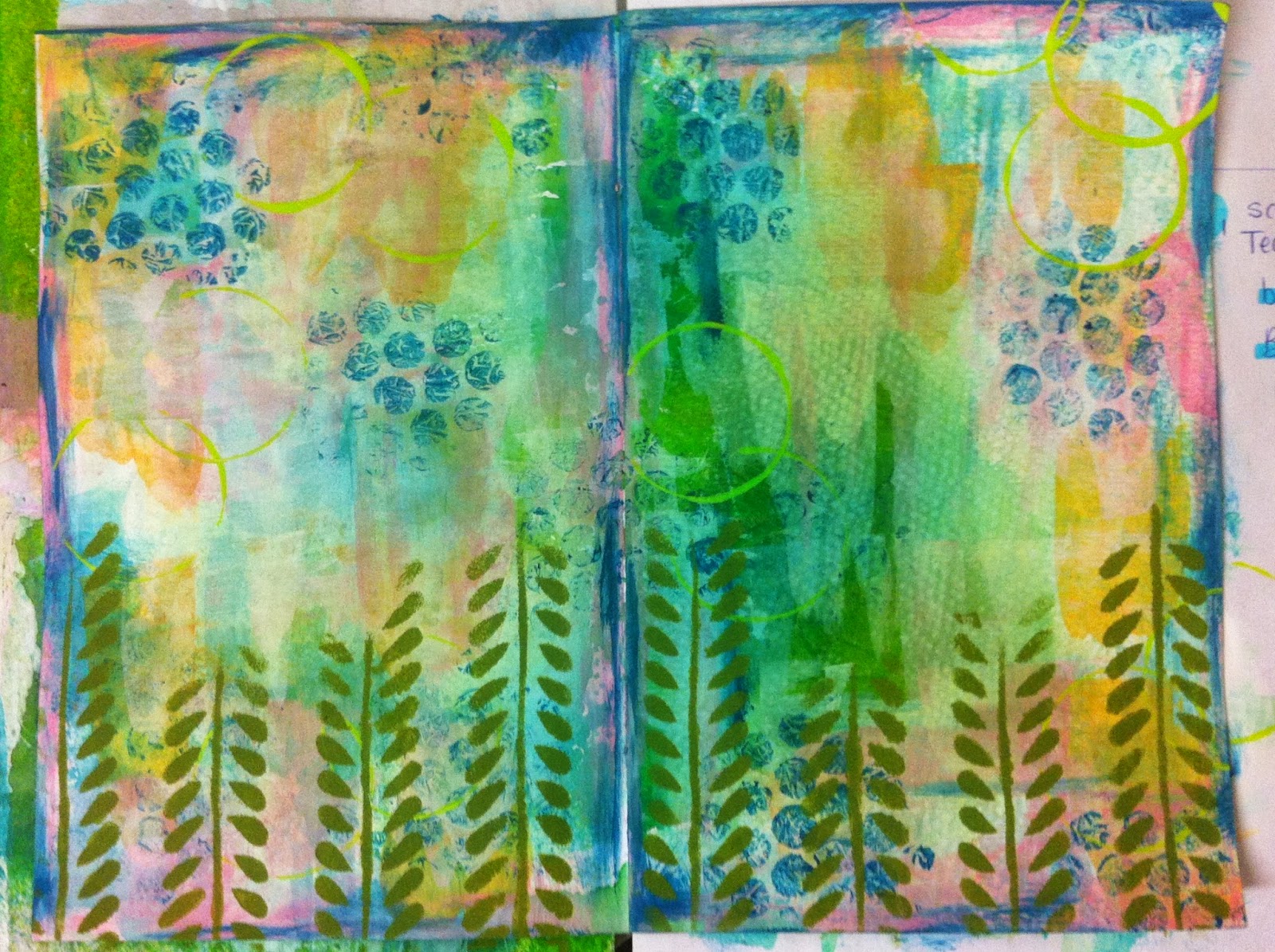
My starting point was the cling wrap background. I used an old plastic card to swipe gesso and acrylic paints on the page. I am keeping my palette pastel and light at this stage as I want the lettering to show up against the background.


Add a layer of bubble wrap printing, a favourite technique of mine! Swipe extra paint on the page edges.

Use a toilet roll to print circles of paint. Then use a stencil to create vines along the bottom of the page. I used a foam brush with very little paint to minimise bleeding under the stencil.
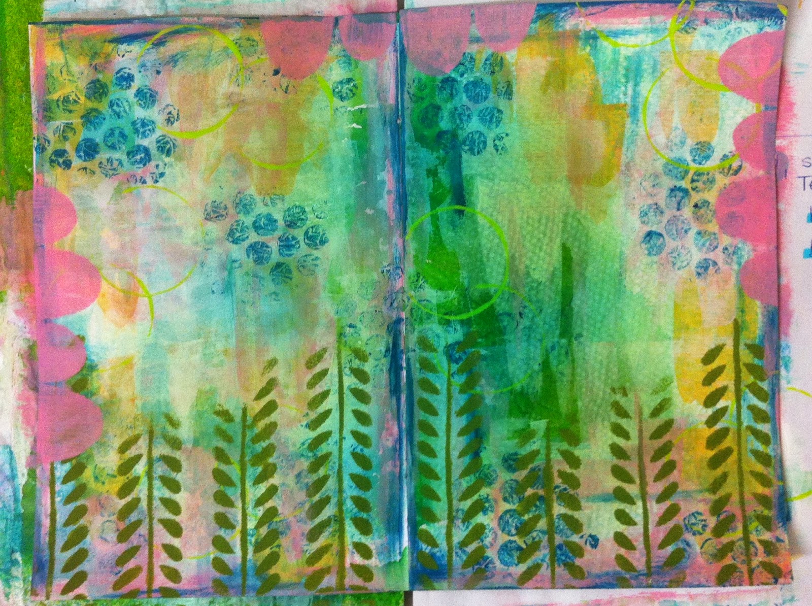
 

Cut scallops out of heavy paper and use a foam brush to paint in the missing areas. This is the opposite of what was shown in last week's video. 


Lightly sketch in the lines and letters begin lettering with a single, simple line. I have mixed capital and lower case letters. Draw in a second line to create some depth and add tiny diagonal lines to create some thickness to the letters. I have then added more lines to the letters using a metallic gel pen.

I have added tiny pink paint dots to the vines to look like flowers. I have used the end of my paint brush to get this look. I have added some doodling with my journaling pens and a dashed line to the scallops.


I hope these instructions and photos inspire you to record your favourite quote, thought or feeling! Wishing you a creative week! Cheers, Lisa xxx

Saturday 7 February 2015

February Week Two: Backgrounds


The Stopover this month is 10 different techniques to apply to backgrounds of journal pages.
  • In the video I layer all 10 on top of each other on one page, but that was just because it was easy for me to demonstrate like that.
  • I would suggest picking up to 5 at a time to layer together.
  • The techniques can be applied in any order.
  • I used only acrylic paints and inks as colour mediums, but other mediums can be substituted.
  • Most of the tools I used came out of the recycle bin. 


Technique 1: Clingfilm Scrunch

  1. Paint your page/s with a layer of retarder medium (gel or fluid, doesn’t matter)
  2. Take a piece of cling-film larger than your page and brush on 2 or three acrylic paints in a random way. Don’t blend the colours.
  3. Place the cling-film, paint side down onto your page/s and scrunch it so the paint spreads around underneath.
  4. Carefully peel off the cling-film and lay it down onto another journal page or a piece of paper to remove the paint. Repeat this step until you run out of paint or paper. These prints can used as backgrounds, or cut up and used in collage.


Technique 2: Brayer

  1. I find a hard rubber brayer works best for this technique. Put a small blob of paint onto a flat surface such as a pad of palette paper and roll the brayer through the paint.
  2. Roll onto the page, go back and forth through the main area of paint until it is spread out thinly.
  3. If it doesn’t look right, keeping rolling. Lots of people stop too soon and have blobs of paint on the paper.


Technique 3: Plastic Sponging

  1. Use a palette knife or brush to spread a thin layer of paint on your palette
  2. Scrunch up a piece of plastic into a ball and dip it into the paint.
  3. Blot the paint onto the page.
Technique 4: Scraping
  1. Squeeze out some paint onto the edge of an old card, a palette knife or a piece of card from the recycling. Or, pick up paint from your palette with the edge of the card/knife.
  2. Scrape the paint onto the page.
  3. Try dragging it from the edge of the page to the middle
  4. Try scraping it on in all different directions.
  5. Try loading your card with two different colours and scraping them on at the same time.
Technique 5: Stamping with Recycling
  1. Paint a piece of bubblewrap and use it as a stamp
  2. Peel the paper off one side of a peice of corrugated cardboard, paint it and use it as a stamp.
Technique 6: Tissue Paper Collage
  1. Dressmaking patterns are printed on tissue paper, and they are available at op shops (thrift stores). You can also recycle the tissue that comes in gifts and shoe boxes.
  2. I like to use a plastic card to scrape a thin layer of glue or paint onto the page, then smooth the tissue onto the top. 
  3. You can also use a brush, but don't work the tissue too much or it will tear as it gets very delicate once wet.
  4. Don't try to smooth out the wrinkles too much, this is part of the effect.
Technique 7: Masking
  1. Cut a scallop from a piece of recycling (eg. a letter from the bank, or magazine cover).
  2. Place the mask onto the page and brush paint over it in one direction only so the paint doesn't travel under the mask.
Technique 8: Dripping 
  1. In the video I am using a fine-tipped bottle filled with fluorescent pink paint thinned with water (about 50:50). 
  2. You can buy plastic pipettes and eye droppers cheaply, try a chemist (drugstore) if you can't find any at your art/craft/discount store. I have seen them on Ebay as well. 
  3. Water down some acrylic paint, suck it up with the pipette
  4. Hold your page at about a 45 degree angle and drop the liquid onto the page, allowing it to run.
  5. Tap the page on the desk to encourage the paint to flow. 
  6. Spray water onto the drip to encourage the flow (don't spray close to the page).
Technique 9: Stencilling
  1. I applied the paint through the punchinella with a piece of Ranger's Cut'n'Dry foam. A cosmetic sponge works the same.
  2. Spread the paint out in a thin layer, dip the sponge in the paint, then dab almost all of it off.
  3. Hold the stencil steady with one hand and apply the paint in an up and down motion with the other. You can also try rubbing the paint on, but it can travel under the stencil.
  4. Move around the page applying the stencil in different sized areas.
Technique 10: Flick and Splatter
  1. Move anything on your desk that you don't want paint on, or cover it up (iPads, phones etc)
  2. Water down a drop of paint until it is the consistency of thin cream.
  3. Load a brush with the watery paint, hold something hard in your other hand (eg., another large brush), and tap the loaded brush onto the object over the page.
  4. Hold it close to get splatters that are close together, hold it further up in the air to get a wider spread of droplets.
  5. Reload the brush with watery paint, then flick the paint off onto the page, like you are cracking an imaginary whip.
Next week I will show you how I finished off my art journal spread with a quote.

Sunday 1 February 2015

February Week One: Lettering


Gidday Passengers!

My name is Annette Poacher and I am your guide for Month 2 – February. On this month’s Roadtrip we will be exploring Lettering/ Backgrounds and Quotes. Three of the fundamental ingredients to Art Journaling.  Although Lettering or words are not always necessary – I personally like quotes and positive affirmations on my pages. They remind me that I have a good life and if things are a little shaky in my world they let me know that tomorrow is another day with new beginnings and opportunities.

So I am going to share with you some of my “secrets” to lettering and backgrounds. Some of you will be familiar with them but hopefully I can introduce you to some new techniques and combinations.

As I am covering two separate topics I am splitting my detour and calling it “A Fork in the Road” – Turn Left and you get “Signage” (which refers to Lettering). Turn Right and you get “Backseat Backgrounds”. 

Ok so let’s kick things off with:


DETOUR 1: SIGNAGE:
Oh boy, have we got a lot to cover with lettering. Here are couple of videos I found to start things off.

Your first task this week is to print out this practice paper and start experimenting with different heights and widths of letters, like this:

Once you are feeling a bit more confident, draw in letter shapes the following on Watercolour paper:


  • What country you are from
  • The town/city you live in.
Please stop there….we will be continuing with the next step next week.

DETOUR 2: BACKSEAT BACKGROUNDS
You are probably going to get sick of hearing me say LAYERING this month. But to create depth we need to layer and layer and layer and layer. The best way I think to explore backgrounds is to experiment with each technique and then put them together. So, let’s start with two techniques for backgrounds:
You can also apply the video technique on watercolour paper and canvas. 

This video is great however I was actually looking for a video to show you how to use glad wrap with retarder medium and acrylic paints. ("Glad wrap" is also known as cling film or plastic wrap.)


Watercolours, Retarder Medium and Glad Warp on Watercolour Paper
Picture 1
Picture 1: Watercolours x 2 colours/Retarder/Glad Wrap/Watercolour Paper.


I got a piece of glad wrap and using a paint brush a little water and watercolour paint, applied the paint straight onto the glad wrap. Working quickly I painted a generous amount of retarder onto the paper and then put the glad wrap facing down onto the paper. Peel the glad wrap off. I used a light and a dark colour for contrast.

Acrylic Paint, Retarder Medium, Glad Wrap on Mixed Media Paper
Picture 2
Picture 2: Acrylic paint x 2 colours/Retarder/Glad Wrap/Strathmore Mixed Media Paper.

I used the lighter colour for my base colour on the paper and then picked up the retarder in my brush and some of the green paint and applied it to the glad wrap. Pop the glad wrap face down onto the paper and peeled it back.

Tips: 


  • If you want to put another layer over the top of watercolour – spray a fixative over your page so it doesn’t re-activate.
  • When painting the glad wrap use a small amount of paint. The idea is to create a pattern but still let some of the colour come through from underneath.


Nearly all my pages include a quote. I have suffered with anxiety and panic attacks for most of my life and found various things over the years to help me control it. Positive affirmations have most definitely played a role. So sourcing quotes is very easy these days due to our friend the internet, just use your favourite search engine, and there will be thousands of sites to choose from. But I have found some wonderful Facebook pages:


Later in the month we will be combining quotes with our lettering.

Important Links:

Driver Reviver Facebook Group: https://www.facebook.com/groups/966728763342652/

Kreative Koncepts Online Shop: http://www.kreativekoncepts.com.au

Kreative Koncepts Mixed Media Blog: http://www.kkmixedmedia.blogspot.com.au